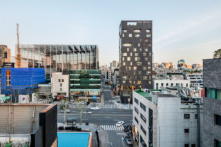
Marie Claire Korea, Singles, Maison, Beauty+: the glossy magazine titles The Book Company publishes unequivocally reveal its position in Korean society as an ultimate trendsetter at the forefront of beauty, fashion, and lifestyle. What is most intriguing, though, is the sheer banality that persists underneath all the luster the magazines convey and their recursive negation of its very existence. The same goes for the spatial presence of a corporate headquarters, oftentimes destined to become a company's flamboyant public image, while also responding to the mundane requirements of workforce and asset management. Here, utterly practical needs have driven the design: a typical, rectangular floor plan, a dark and thick skin to comply with the energy code and withstand dusty winds, and a maximum height to exploit temporary FAR allowances. The resultant volume, starkly dark, solid, lean, and simply out of proportion from its neighbors, nevertheless presents an uncanny that is image far from ordinary. A morse-code-inspired relief pattern on GFRC panels adds to its enigmatic appearance that masks the pervasive boredom inside. It’s a tacit monolith, perpetually suspended between being dazzling and dull.
Project facts
Location Seoul, South Korea
Architect N.E.E.D. Architecture
Year 2017
Project Team C&O Construction; François Perrodin; HANA Consulting Engineers; Kyungsub Shin; Taeyoung Geotechnical Engineering; THEKUJO; Top Jung Engineering
Category Commercial
AIANY Recognition
2018 AIANY Design Awards
